

> A logotype was produced of seamlessly constructed and crafted letterforms to reflect the attention to detail that Seamless Building Services provides. The use of wood as a texture in the logo represents their hands on approach to their craft using natural materials.

> To make the business cards really stand out and be retained in a crowded market unique wooden cards were produced to reflect the identity of the brand and help with the memorability of the brand through the tactile nature of the material.

> This jewellery company has a very earthy, organic and hand crafted identity - so the branding needs to reflect this. The letterform has a very free flowing and hand drawn look which connects to the organic feather shape in the same way that the jewellers connect, and work in harmony with the materials they use within their pieces.

> An alternate icon mark was also produced to be used within limited space.

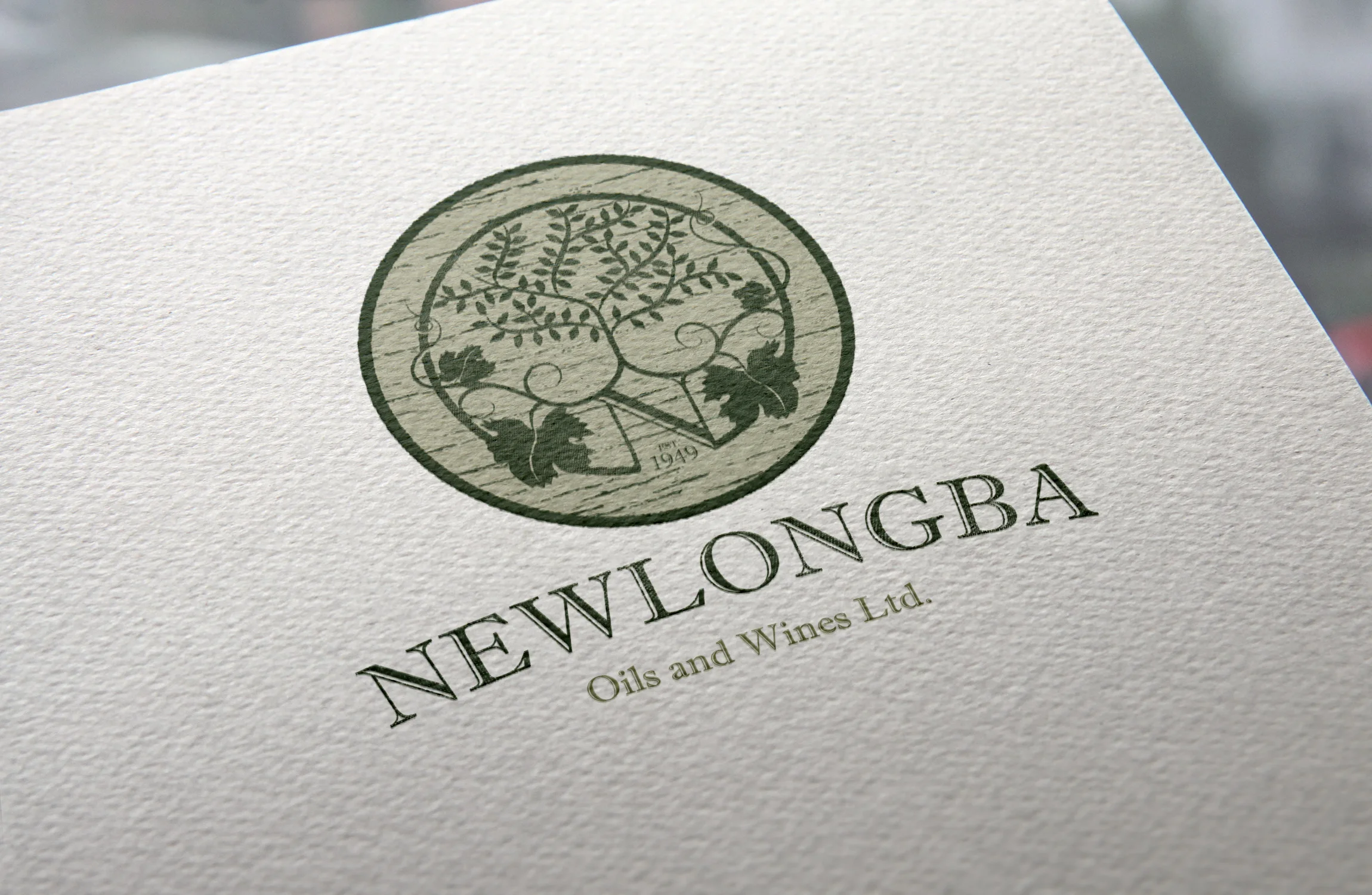
> With a long history in the winemaking industry, this company was looking to expand into olive oil. This required a change to the existing logo to incorporate their oil products. The illustrative icon is built on a base of grape vine leaves - to represent the companies origins - with an olive tree growing up form these deep roots. The colours used represent both the vine leaves and olive trees, and along with the barrel texture in the background give it a rustic feel so that the company can still retain a sense of its origins as a small boutique producer.
> With a long history in the winemaking industry, this company was looking to expand into olive oil. This required a change to the existing logo to incorporate their oil products. The illustrative icon is built on a base of grape vine leaves - to represent the companies origins - with an olive tree growing up form these deep roots. The colours used represent both the vine leaves and olive trees, and along with the barrel texture in the background give it a rustic feel so that the company can still retain a sense of its origins as a small boutique producer.

> With a long history in the winemaking industry, this company was looking to expand into olive oil. This required a change to the existing logo to incorporate their oil products. The illustrative icon is built on a base of grape vine leaves - to represent the companies origins - with an olive tree growing up form these deep roots. The colours used represent both the vine leaves and olive trees, and along with the barrel texture in the background give it a rustic feel so that the company can still retain a sense of its origins as a small boutique producer.

> This logo needed to represent the journey to emotional, physical and mental healing. The transformative qualities of a phoenix have been used to represent how they can rise from the ashes with a new and positive lease on life and be surrounded by a rejuvenated aura.
> OzGlobal were looking to redesign their logo upon the expansion of their business from ice cream and waffle cones into new, healthier fruit and nut product lines. The colours used reflect the origins of the company - through the use of a waffle cone and chocolate colours, contrasted with the freshness of the blue sky colour. The base of the logo reflects the waffle cone origins with the newer, healthier ingredients above with the dawning rays of light shining across this latest range.

> OzGlobal were looking to redesign their logo upon the expansion of their business from ice cream and waffle cones into new, healthier fruit and nut product lines. The colours used reflect the origins of the company - through the use of a waffle cone and chocolate colours, contrasted with the freshness of the blue sky colour. The base of the logo reflects the waffle cone origins with the newer, healthier ingredients above with the dawning rays of light shining across this latest range.

> Drum Digital needed a logo to reflect how they can help their clients reach and engage their online audience. The use of the two 'D's in the logo represent how they help to amplify their clients online voice and use the correct social media platforms to make them more visible to consumers.